Car manufacturers’ logos constitute an essential aspect of a vehicle’s identity. These logos signify wealth, excellence, or status. They not only function as symbols of a company but also demonstrate its popularity. Significantly, a logo can establish an emotional connection with customers. Within an advertising campaign, the logo holds paramount importance in attracting customers actively. The history of car logos is extensive and illustrious. In this article, we will examine the most iconic car brand logos. We will delve into their history, design, and taglines. Let’s get started!
1. Tesla

- Founded: 2003
- Headquarters: USA
- Tagline: NA
In 2006, RO Studio created one of the most iconic car brand logos. Consequently, Musk has a longstanding history with the studio. The initial logo featured a black backdrop with a T. The letter T portrayed the cross-section of an electric motor and resided within a shield that depicted security.
In 2016, Tesla revamped its emblem to a simpler style. The stylized “T” reminiscent of an electric motor’s cross-section remained, however, it had grown larger and more prominent. The shield was removed, giving way to a logo with a white backdrop and a black outline.
The Tesla logo presents a white stylized “T” against a black background. The “T” mimics the cross-section of a red electric motor. The white background represents purity and newness, while the black outline introduces a sense of strength and sophistication to the emblem. The logo maintains a straightforward and uncomplicated design.
2. Lamborghini
- Founded: 1963
- Headquarters: Italy
- Tagline: “Expect The Unexpected”
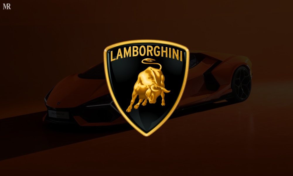
Giorgio Giugiaro, an Italian vehicle designer, created the Lamborghini emblem in 1963. The zodiac emblem of the company’s founder, Ferruccio Lamborghini, features a roaring bull.
Firstly In 1974, they somewhat enlarged the bull and changed the backdrop color from orange to yellow. Secondly, In 2006, they further modified the design to give the logo a more current look. However, they kept the logo’s color scheme and shape unchanged.
Meanwhile, the present logo showcases the renowned bull and shield, both in gold. The bull, corporate name, and shield border all gleam in gold, while the background behind the bull is now black. This combination symbolizes Lamborghini’s commitment to power, luxury, and Italian craftsmanship.
3. Honda

- Founded: 1948
- Headquarters: Japan
- Tagline: “The Power of Dreams”
The Honda logo originated in 1946. It showcased a straightforward design – Firstly, it had a black H with the word Honda written below it. In 1963, the company revamped the logo by incorporating a red background to convey passion and energy. This alteration resulted in one of the simplest yet most modern car brand logos.
While the logo has undergone slight updates throughout the years, however, the core concept remains unchanged. The font of the word “Honda” saw modifications in 1980, accompanied by a slightly larger H. Further modernization of the logo took place in 2002.
The emblem’s white color signifies purity, while the sophisticated silver H represents wealth and elegance. Honda’s logo epitomizes dedication, excellence, innovation, quality, and performance.
4. Ferrari
- Founded: 1947
- Headquarters: Italy
- Tagline: “We are the Competition”
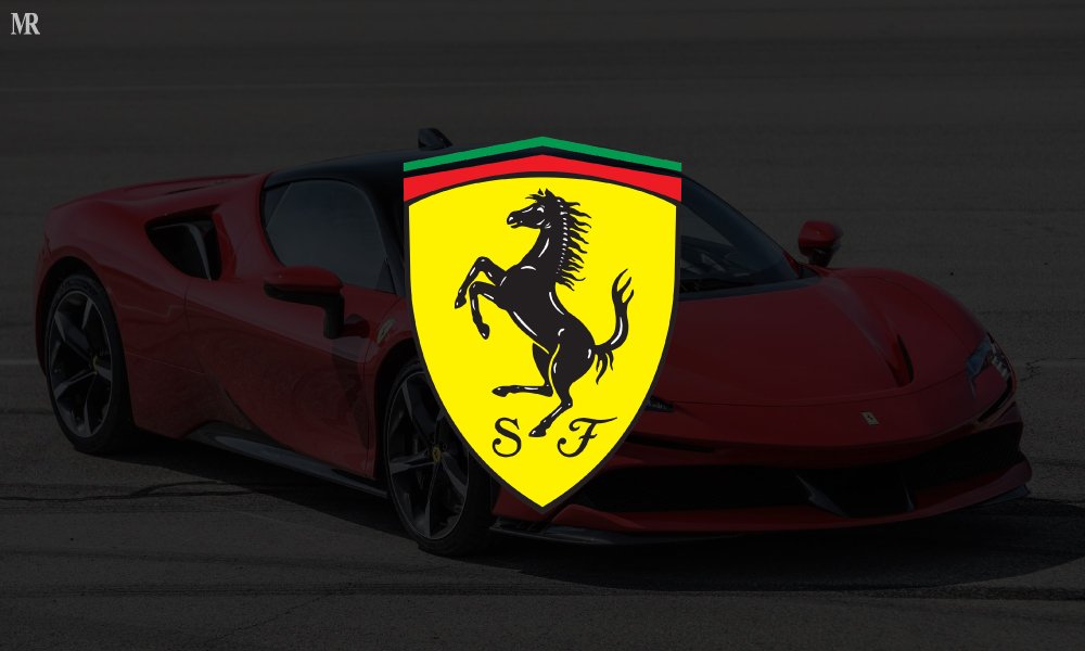
Count Francesco Barraca created the Ferrari logo in 1923. Ferrari chose the insignia as a good luck charm and has since used it in the car. Meanwhile, Ferrari ranks 3rd in the list of the most iconic car brand logos.
Over the years, the Ferrari logo has undergone various minor changes. Firstly, in 1932, Ferrari enclosed it in a seal with the words “Scuderia Ferrari” etched on it, along with a black prancing horse and the Italian flag. However, in 1947, they removed the shield and modernized the logo. They deleted the words “Scuderia Ferrari,” turning the design into a rectangular shape with a black border around the Italian flag.
The current logo is immediately recognizable, featuring the prancing black horse and the unchanged background yellow color. The emblem still displays the Italian flag, but without a border, and maintains the unchanged rectangular outline.
5. Toyota

- Founded: 1937
- Headquarters: Japan
- Tagline: “Let’s Go Places”
Toyota created its logo through a public competition. They proposed renaming the logo to Toyoda. The 1935 logo featured a red and white diamond with the word TOYODA in the center. Toyota’s logo stands out as one of the most unique car brand logos.
Secondly, the company modernized the logo in 1967 and changed the colors from red and white to blue and white. They designed the oval emblem in 1989, and after that, it quickly gained popularity. The insignia appeared beside the corporate name. The color scheme included silver and crimson.
In 2019, the company once again updated its oval emblem, giving it a more refined look. Today, the company mainly displays the oval logo on its own, often in white on a white background.
6. Porsche

- Founded: 1931
- Headquarters: USA
- Tagline: “There Is No Substitute”
The Porsche logo stands out as one of history’s most well-designed logos. Franz Xaver Reimspiess crafted this logo in 1952. The shield embodies Porsche’s headquarters. The rampant black steed pays homage to the city of Stuttgart’s coat of arms.
In 1963, Porsche adopted a more fashionable font for its name. In addition to that the seal underwent enlargement in 1952. Though updated in 2002 to achieve a more modern look, the color palette remained unaltered. The logo signifies superiority, luxury, and German engineering actively.
The logo’s black tone conveys power and sophistication, while the white letters spelling “Porsche” represent purity. Secondly, the black horse symbolizes speed, strength, and agility, and the emblem’s antlers reflect Baden Wurttemberg’s coat of arms.
7. Bentley

- Founded: 1919
- Headquarters: U.K.
- Tagline: “The Silent Sports Car”
The first logo, a plain B on a black backdrop, originated in 1919. Its design aimed to symbolize speed and freedom, representing Bentley through the letter B. However, the logo’s design remains unchanged but has undergone significant alterations.
The official Winged B, still in use today, was established in 2002. However, vehicles produced during the Centenary year stood apart by outlining the B and the surrounding oval with a distinct metallic finish called Centenary Gold.
The Bentley logo also stands out for its user-friendliness and adaptability. The number of feathers on Bentley wings varies across models, adding an intriguing detail not familiar to everyone.
8. BMW

- Founded: 1916
- Headquarters: Germany
- Tagline: “Sheer Driving Pleasure”
The logo’s first iteration dates back to 1917 when Rapp Motorenwerk, the original company that formed BMW, created it. The logo featured a black horse’s head against a white background, highlighting the company’s connection to aircraft engines.
A significant transformation occurred in the company’s logo in 1936, replacing gold accents with silver. Secondly, the white and blue pattern at its core underwent a change to a lighter blue tint. Lastly, the words “Bayerische Motoren Werke” were removed in 1942.
In 1997, BMW revamped the logo with a more modern design while retaining the core colors and shapes. This iteration presented a more pronounced 3D appearance. The latest logo adopts a contemporary and minimalistic style, featuring shades of grey, blue, and white. It takes on a spherical form and incorporates grey letters and outlines.
9. Rolls Royce

- Founded: 1906
- Headquarters: U.K.
- Tagline: “Effortless Luxury”
The first Rolls Royce logo featured the brand’s renowned insignia atop an elegant coat of arms. The initial color palette of the company’s visual identity was red. Rolls-Royce started using a more straightforward logo in the 1930s.
The spirit figure saw an increase in 1911. In addition to that, the wings of the figurine underwent reinforcement in 1925. The spirit underwent alterations to achieve a slimmer appearance in 1971. The badge comprised three colors: light grey, dark blue, and white.
Meanwhile, by 1973, the logo sported a softened, dark blue square, housing a monogram in silver and white. The silver and black plate, present in the earliest logos, remained in use by Rolls Royce from 1998 until 2020. It wasn’t until 2020 that the design took on a more elegant form, with ‘RR’ inscribed in a sharp black font against a white backdrop.
10. Ford

- Founded: 1903
- Headquarters: USA
- Tagline: “Go Further”
In 1903, Ford Motor Company created the original Ford logo. The logo featured black and white colors and etched the words ‘Ford Motor Company.” It surrounded the phrases with an intricate frame of leaves and whirling swirls, all written in a curvy sans-serif typeface.
Secondly, in 1912, they updated the logo to a more stylish script, printing the word “Ford” in lowercase characters. Ford introduced the blue oval emblem in 1927, symbolizing liberty: the blue oval represented the sky, while the white word “Ford” represented the clouds.
Modifications were made to the font of the word “Ford” in 1957, and a slight enlargement was applied to the oval. A redesign in 2003 gave the logo a more modern style while retaining the core colors and shape. However, the current logo, simple yet contemporary, emphasizes dedication.
In conclusion, these car brand logos have gained popularity because they accurately communicate the company’s goals. As time progressed, designers refined these logos to become more visually appealing. Every automobile manufacturer now strives to emotionally connect with their audience actively. The company’s founders also emphasized including a nostalgic element from their history in each design. While some logos have undergone multiple updates, the majority have only experienced slight alterations. These elements played a significant role in popularizing the logos.
We hope that you gained some valuable knowledge through this blog. For more content, keep reading Business APAC.

