After many years Gmail account is going to have a notably new look. Gmail is being redesigned. Google sent out an email to G Suite administrators warning them a “fresh, clean look” would be coming to Gmail.com soon. Shortly after the email went out, leaked pictures of the design were posted to Android Authority and The Verge, so we have a ton of pictures to obsess over.

The email was intended to prepare employees/workers tasked with managing companies’ G Suite apps – Gmail, Calendar, Docs, Sheets, etc – to answer questions about the redesign as it’s rolled out to personal accounts, meaning we could expect it to look noticeably different.
Perhaps the biggest change to Gmail will be plugins to other Google apps like Calendar, which would save users, time, and the hassle of clicking back forth between the screens. Clicking on one of the icons in the thin vertical bar in the top right corner appears to pull the respective app in, while still giving the user a clear view of the whole inbox.
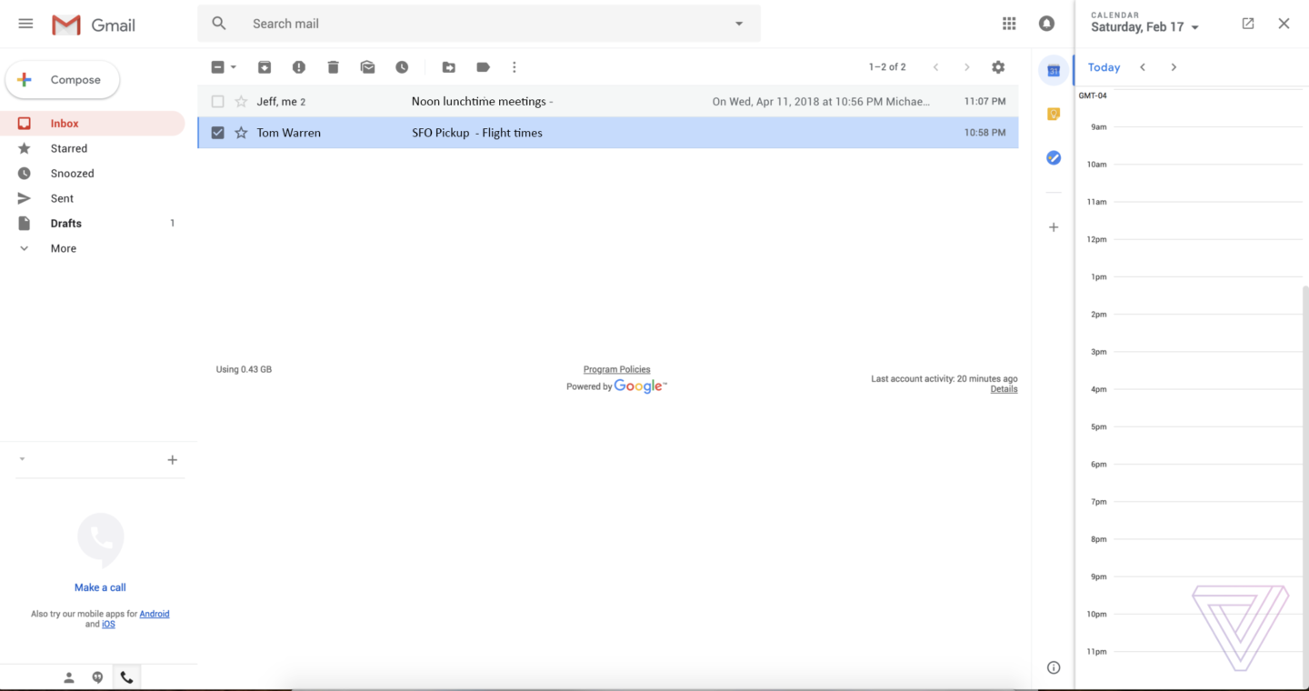
Gmail is pulling in a few features from its sibling, Google Inbox. First, there’s a new “snooze” feature, which lets you remove an email from your inbox for a set amount of time. Second, Gmail.com is getting Smart Replies, which offer up machine-learning-generated replies to your emails that you can send with a single click.

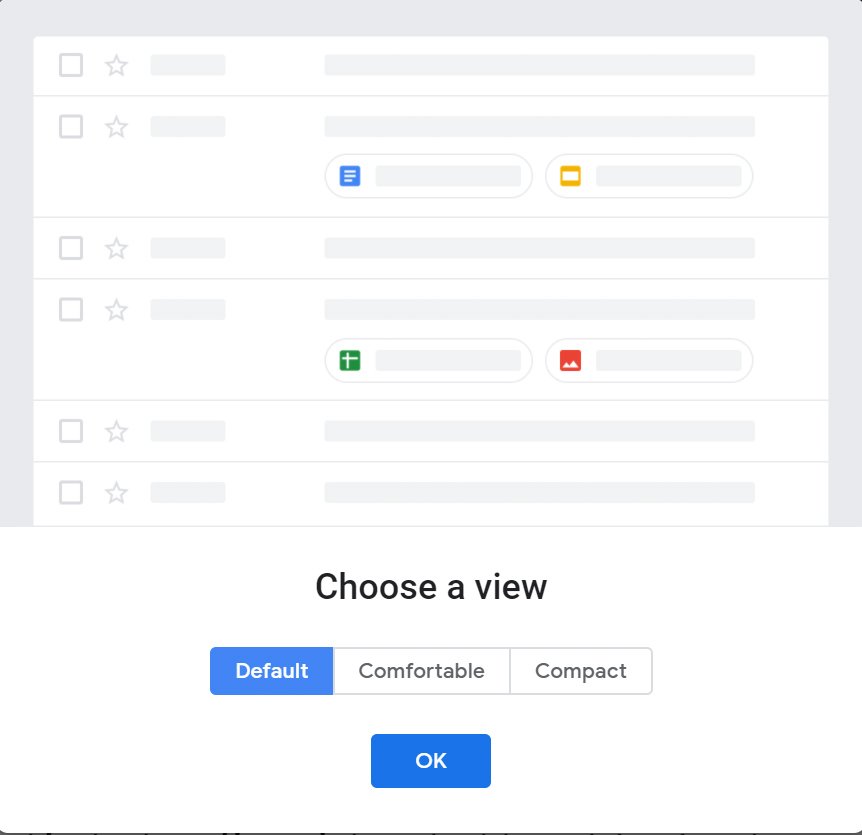
Google will come up three views to choose from:
- Compact view looks like the current version of Gmail. This layout looks like it’s designed for people who hate change.
- Default view highlights attachments, such as images or documents.
- Comfortable view doesn’t highlight those attachments
Besides the new features, there are a lot of small design changes have been made. Many of which seemingly conform to the theorized “Material Design 2” changes seen in Android P. The font for the interface is changing from Arial to Product sans, the same font was used in the Google and Alphabet logos – while messages will be using Google’s Roboto font. Just like Android P, there are lots of round or pill-shaped UI elements. The compose button is a pill, along with the pink inbox selection highlight. It would have expected that the search bar to change to a pill shape just like every search bar in Android P, but for now it is still a rectangle.
Google confirmed these changes. They have said that they are working on some major updates of Gmail. They need a bit more time to compose themselves, so can’t share anything yet — archive this for now, and they will let us know when it’s time to hit send.
If you just want everything about Gmail to stay the same, don’t worry, it’s new look isn’t a dramatic departure from the current one. Every tool you rely on is still in the same place.
Follow our social pages to stay updated with latest news: Facebook, Twitter, LinkedIn.


