Can you picture a piece of handwriting that’s more recognizable to more people on Earth than almost any other symbol? That’s the sheer power of the Coca Cola logo. It’s not just a brand mark; it’s a piece of Americana, a global icon with a story stretching back over an incredible 130 years.
Its advertising slogans have literally become part of our shared cultural language. But how did it all begin? Let’s pull back the curtain and take a stroll through the fascinating Coca Cola logo history, exploring its humble origins, the tiny tweaks that made a huge difference, and the genius decisions that cemented its place in our hearts forever.
Get ready, because this is a story you won’t forget.
Let’s Explore Coca-Cola Logo History
1. The Genesis: 1886 – A Bookkeeper’s Stroke of Genius
Believe it or not, the world’s most famous logo wasn’t born in a fancy design studio. It was born in the mind of an accountant!
- Back in 1885, it was Frank Mason Robinson, the bookkeeper for Coca-Cola’s inventor, John Pemberton, who had the spark of brilliance.
- Robinson didn’t just come up with the name ‘Coca-Cola’; he was the one who personally scripted its now-legendary typeface.
- He chose a popular style of the era called Spencerian script—a flowing, elegant handwriting. Why? He felt it oozed class and professionalism, a perfect fit for the brand’s ambitions.
- This script, first adopted in 1887, was the unique symbol Robinson dreamed of. And get this—it was officially registered as a U.S. trademark in 1905, locking in a legacy that was just getting started.
2. The Chronological Evolution: A Visual Journey Through Time
What’s truly mind-blowing is how little the core design has changed. For over 138 years, while refreshing the world, Coca-Cola has shown us that consistency is king. But there have been some fascinating little detours along the way!
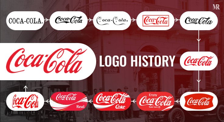
- 1890: The Short-Lived Swirl
For a brief moment, the brand tried something wildly different. The 1890 logo sported a much more unusual, swirly style that looked nothing like the logo we know and love. A true collector’s item in design history!
- 1903-1931: Trademark Registration Details
The version of the logo that feels most familiar first appeared in 1903. It was based on the original script but with letter contours that were a bit narrower and taller, and the lines were bolder. A cool detail: between 1903 and 1931, the words ‘Trade mark Registered’ were cleverly tucked right into the swooping tail of the first ‘C’ in ‘Coca.’
- 1941-1960s: Trademark Relocation
Things got shuffled around a bit here. From 1941 into the 1960s, that ‘Trademark Registered’ text moved out from the ‘C’ tail. Instead, it was noted as ‘Reg. US Pat Off.’ and placed just below the main logo. The 1941 design was a huge milestone—it really laid the foundation for the modern visual identity we see today.
- 1969: The Dynamic Ribbon Device
Ah, the famous wave! In 1969, the logo introduced the ‘Dynamic Ribbon Device.’ This was that iconic white ribbon, or ‘wave,’ that now flows beautifully underneath the ‘Coca-Cola’ script. What a perfect addition!
- 1985: The New Coke Controversy
This is where the story gets seriously dramatic. On April 23, 1985, Coca-Cola’s chairman and CEO, Roberto Goizueta, announced a new formula he called ‘smoother, rounder, yet bolder.’ But the public wasn’t having it! The press—and the people—said New Coke tasted sweeter, more like Pepsi. The outcry was massive! After just 79 days of chaos, on July 11, 1985, the executives brought back the original formula, triumphantly rebranding it as ‘Coca-Cola Classic.’ What a lesson in listening to your fans!
- Today: The ‘One Brand’ Strategy
The evolution never stops. Today, with its ‘One Brand’ strategy, the Coca Cola logo continues to be a powerful symbol of happiness and togetherness. It’s so iconic that you can see the shape of the bottle in your mind’s eye, even when it’s not there. Now that’s impressive, isn’t it?
3. Deconstructing the Genius: The Science Behind the Symbol
So, what’s the secret sauce? How has this logo remained so charming and relevant for so long? It all boils down to two incredibly powerful design elements.
- The Power of Red
Can you even imagine Coca-Cola in another color? Impossible! The company decided on red early in its history, but it was the 1934 redesign that truly cemented the iconic red we know today. The stunningly simple red and white color scheme makes the script pop and is designed to spark feelings of passion, youth, energy, love, pureness, and class.
- The Unchanging Script
That gorgeous Spencerian script has been the one constant, the anchor through every era of the logo’s development. Consumers accepted it, they fell in love with it, and it became a key to the brand’s identity. The classic, fluid font has been absolutely essential for maintaining brand recognition, and it just makes you feel a sense of bliss and union.
4. The Logo and The Bottle
It’s a legendary duo! The logo and the equally famous contour bottle have become woven into the fabric of our cultural history.
- They inspire a level of brand loyalty that is the envy of the world.
- They are the reason so many of us are happy to pay a premium for a Coke.
- The logo is so powerful, it can instantly bring the image of that unique bottle to mind, even when it’s completely absent.
5. Cultural Impact: More Than a Mark
Let’s be real: the Coca Cola logo isn’t just some writing on a can. It is a true insignia that has become completely ubiquitous in Western society.
- The logo has been celebrated and integrated into so many parts of pop culture. Just think of the 2009 ‘Tribute to Fashion’ charity project, where Italian design legends like Moschino, Donatella Versace, Blumarine, and Angela Missoni created their own stunning limited-edition bottle designs.
- Coca-Cola’s genius for storytelling has kept the brand memorable and relevant, right alongside other global icons.
- From tiny local events to massive global gatherings, the Coca-Cola logo adorns an unbelievable range of activities, solidifying a legacy that goes far beyond a simple beverage.
My Opinion
The global dominance of the Coca-Cola logo is a masterclass in branding. It’s a stunning example of how strategic marketing can create a legacy that lasts for generations. The brand’s true genius lies in its unwavering protection of its core asset—that beautiful Spencerian script—while constantly innovating everything around it.
It’s a blueprint for success that countless companies have learned from. This brilliant strategy ensures the brand’s identity remains consistent and instantly recognizable, helping Coca-Cola stand out in a fiercely competitive world. That specialized logo, paired with its vintage bottle and classic font, perfectly demonstrates how powerful consistency can be when combined with smart, localized positioning.
Here Are Some Lessons From Coca-Cola’s Logo Journey
- The Unbreakable Vow of Consistency:
For over 130 years, the Coca Cola logo history says, the core design has barely budged. This shows that consistency isn’t boring; it’s how you build a timeless brand that people know, trust, and recognize in a heartbeat.
- Make It Simple, Make It Yours:
Frank Mason Robinson knew the logo had to have a distinct look. The Spencerian script was simple, elegant, and totally unique. The lesson? A distinctive logo helps you stand out and instantly tells people who you are.
- Connection is Stronger Than Commerce:
Coca-Cola doesn’t just sell a soft drink; it sells feelings. Campaigns like ‘Open Happiness’ and ‘Share a Coke’ are all about creating a powerful emotional bond that goes way beyond the product itself.
- Stay True While You Innovate:
While the Coke logo looks the same everywhere, the marketing is tailored to fit local cultures. This proves you can innovate and adapt to different markets without ever losing the core identity that makes you special.
- Your Brand Belongs to the People:
The ‘New Coke’ disaster of 1985 was a humbling and powerful lesson. It taught the company that consumers feel a real sense of ownership over the brands they love. As they quickly learned, ‘Our boss is the consumer.’
Blown away by this journey through branding history? Don’t keep it to yourself! Hit that share button and let your friends in on the incredible story behind the world’s most famous swirl.


